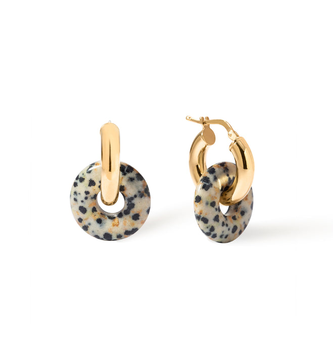
How to combine jewelry and its colors? Fashionable and confident color combinations.
The right color combination in jewelry can enhance beauty, add character, or lend a subtle elegance to an outfit. But sometimes choosing colors can be a challenge. Which shades work well together, and which should be avoided? Learn the most important rules for color matching and how to choose colorful jewelry for different styles and occasions, so each outfit looks like a carefully considered stylist's design!


The Basics of Combining Colors in Jewelry – Where to Start?
Color is crucial in jewelry. It can liven up a look or, conversely, introduce subtle harmony and cohesion. But how can you ensure color combinations look elegant and stylish? First, you need to understand which colors work well together and which might create an undesirable contrast. It's helpful to examine your own wardrobe and identify the dominant shades. This will make choosing cohesive accessories much easier. Don't forget the aesthetic qualities of precious metals! Silver, gold, and even rose gold serve as a color base, from which we select other hues.

Check out the products in the photo! [1. Viva Blueberry XL Ring 2. Viva Black XL Ring ]
The Color Wheel - Your Ultimate Guide to Harmony
The color wheel is a tool that facilitates the creation of consistent or contrasting color combinations in jewelry. It is based on the principles of color theory and helps you consciously choose the colors of individual accessories.
The color wheel allows you to identify:
-
primary colors – red, yellow and blue, i.e. colors that cannot be obtained by mixing other colors;
-
secondary colors – created by combining two primary colors, e.g. red + yellow = orange;
-
tertiary colors – shades created by mixing a primary color with a secondary color, e.g. red-orange;
-
complementary combinations – colours that lie opposite each other on the colour wheel (e.g. green and red), which create a striking contrast;
-
analogous combinations – colours adjacent to each other (e.g. pink, red, orange), ensuring a harmonious and coherent effect.


Proven rules for arranging colors
Combining colors in jewelry may seem difficult, but there are simple rules that will help you create cohesive and aesthetically pleasing compositions. By following them, you'll avoid styling chaos and your accessories will look elegant and well-thought-out.
-
The three-color rule – the best jewelry styles are based on a maximum of three colors.
-
The 60-30-10 rule – used in fashion and design, also works in jewelry:
-
60% – dominant color (e.g. gold);
-
30% – complementary color (e.g. navy blue);
-
10% – a striking accent (e.g. red).
-
The power of neutral colors – silver, gold, white, black or beige act as a safe base to which you can easily match any more saturated shades.
-
The principle of contrast and harmony – combine colors that complement each other or belong to the same palette (e.g. pastel) to achieve a well-thought-out effect.
-
Avoiding too many metallic shades at once – combining silver, gold and rose gold in one look can look chaotic if not balanced well.

Check out the products in the photo! [1. Viva Lollypop Ring XL 2. Viva Forget-me-not Ring XL 3. Viva Blueberry Ring XL ]
Proven combinations – what colors can be combined?
Combining colors in jewelry is a difficult art, but there are certain combinations that always look good and complement a variety of styles. Don't want to spend hours wondering if your accessories create a cohesive whole? Below, you'll find tried-and-true combinations that will help you create harmonious and striking jewelry sets.


Classic color pairings that always work
Some color combinations in jewelry are timeless and work regardless of the occasion or current trends. Classic pairings allow you to create elegant and harmonious sets that suit both everyday and evening looks. The most popular include:
-
gold + navy blue – the deep shade of navy blue contrasts beautifully with the warm glow of gold, creating a luxurious effect;
-
silver + blue – cool tones of silver perfectly emphasize the freshness and lightness of blue accessories;
-
rose gold + powder pink – a subtle, romantic combination perfect for delicate and feminine styling;
-
black + white – a classic that never goes out of fashion; an elegant combination suitable for almost any occasion.

Check out the products in the picture! [1. Blackberry Bangle Ring 2. Mosaic Bracelet 3. Osso Bracelet 4. Groove Bracelet ]
A bold trio of colors for those who love experimenting.
If you like to attract attention and aren't afraid of bold solutions, combinations of three intense colors will be a perfect choice. Such compositions allow you to express your creativity and individual style, and when carefully chosen, they can create a cohesive yet energetic whole. Some of the most interesting suggestions include combinations such as:
-
purple + yellow + green – inspired by nature, full of life and freshness, perfect for summer styling;
-
orange + blue + pink – a bold, dynamic set that will work great in casual and streetwear looks;
-
red + turquoise + gold – a distinctive, oriental combination that attracts attention and adds an exotic character.
Remember that when creating three-color sets, it's important to maintain proper balance. One color can act as the dominant one, acting as a backdrop for it.

Check out the products in the picture! [1. Basic Gold Ear Cuff 2. Crush Gold Ear Cuff 3. Splash Blueberry Earrings 4. Pulp Earrings 5. Bangle Ring Blueberry 6. Elipse Cactus Bangle 7. Forget-me-not Bangle Ring 8. Sphere Blueberry Bangle ]
How to combine jewelry in different styles – from minimalism to maximalism
Combining colors in jewelry is both a matter of theory and practicality, adapting them to your style. Minimalists typically opt for subtle, muted hues and simple combinations, while maximalists embrace contrasts and vibrant accents. Learn how to match jewelry colors to different aesthetics!
Subtle combinations for minimalists
In minimalism, color serves as a subtle accent, not a dominant element of the design. Neutral shades, such as silver, gold, beige, or white, work best in this aesthetic, and can be paired with subtle pastels like powder pink, light blue, or mint. Choosing a single color as the starting point for a look is also a good and proven solution. Monochromatic combinations, such as silver with clear stones, add elegance without overwhelming the look.

Check out the products in the photo! [1. Forget-me-not Ring Set 2. Bubbles Blue Bracelet 3. Ivy Silver Bracelet ]
Bold colors and contrast in jewelry – when more is better
Maximalism in jewelry creates room for creativity, bold combinations, and expressive color accents. Intense hues like deep purple, ruby red, or turquoise can be worn with confidence. However, the goal of fashion maximalists should be balance. It's best to opt for one dominant color and two complementary shades to maintain control over the overall look. Layering, or wearing jewelry in layers, for example, several necklaces in different yet coordinating colors , also works well in such cases.
Our colorful Berries collections for perfect combinations
Do you want to enhance your style with unique accessories? At Berries, you'll find resin and enamel jewelry , as well as Bead sets that can easily be matched to any outfit. As a stylist, I recommend the Splash collection , where geometric epoxy resin shapes captivate with subtle pastels and saturated colors, reflecting light with every move.
For an elegant contrast, choose Viva Emalia – 925 sterling silver plated with 18-karat gold and a smooth, intense enamel in vibrant shades. For everyday, light accents, choose Beads , whose beads in shades of strawberry, lemon, or raspberry chilli will bring a touch of joy and lightness to your outfits. Mix these lines according to your imagination, creating cohesive and vibrant compositions that will stand out from the crowd.